
Create Beautiful & Informative Plots in R
Data visualization helps you see patterns, trends, and relationships in your data. In R, the most powerful and flexible plotting system is ggplot2.
In this tutorial, you will learn how to:
- Make basic plots
- Customize colors and themes
- Create bar charts, line charts, scatter plots
- Add labels and titles
- Visualize grouped data
1. Install & Load ggplot2
install.packages("ggplot2")
library(ggplot2)
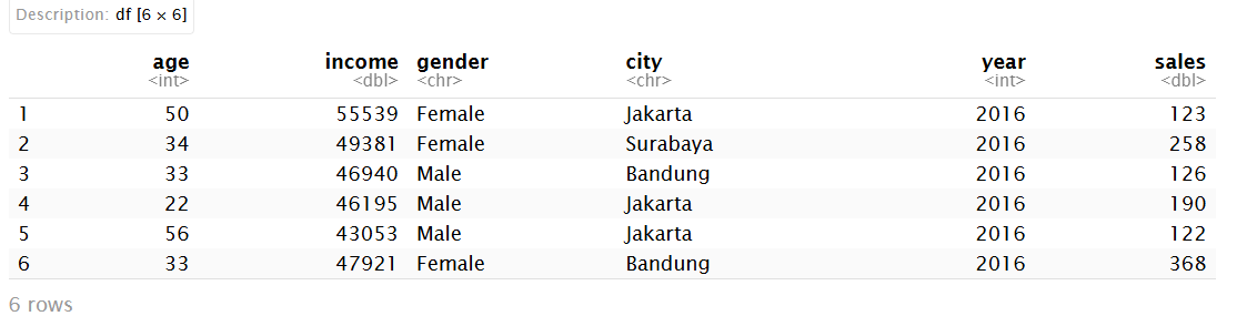
2. Create Example Data
ggplot(data, aeset.seed(123)

data <- data.frame(
  age    = sample(20:60, 50, replace = TRUE),
  income = round(rnorm(50, mean = 50000, sd = 10000)),
  gender = sample(c("Male", "Female"), 50, replace = TRUE),
  city   = sample(c("Jakarta", "Bandung", "Surabaya"), 50, replace = TRUE),
  year   = rep(2016:2020, each = 10),
  sales  = round(runif(50, 100, 500))
)

head(data)s(x = age, y = income)) +
  geom_point()
3. Basic Structure of ggplot
ggplot(data, aes(x = age, y = income)) +
  geom_point()
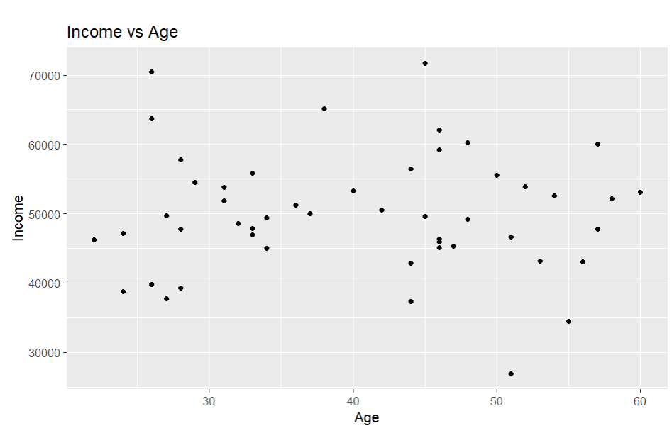
4. Scatter Plot
ggplot(data, aes(x = age, y = income)) +
  geom_point() +
  labs(title = "Income vs Age",
       x = "Age",
       y = "Income")
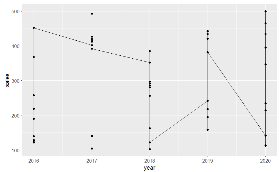
5. Line Chart
ggplot(data, aes(x = year, y = sales)) +
  geom_line() +
  geom_point()
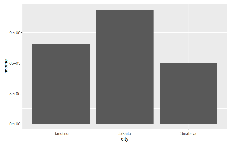
6. Bar Chart
ggplot(data, aes(x = city)) +
  geom_bar()
With values:
ggplot(data, aes(x = city, y = income)) +
  geom_col()
7. Grouped Data
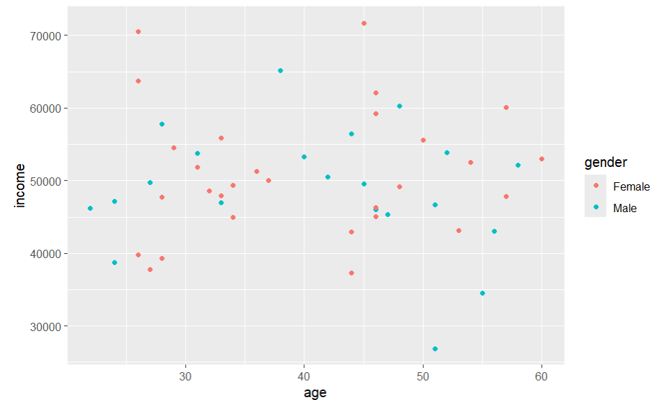
ggplot(data, aes(x = age, y = income, color = gender)) +
  geom_point()
8. Histograms
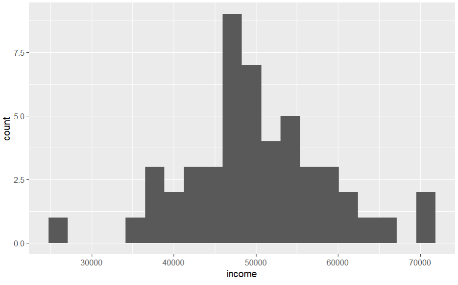
ggplot(data, aes(x = income)) +
  geom_histogram(bins = 20)
9. Themes & Styling
ggplot(data, aes(x = age, y = income)) +
  geom_point() +
  theme_minimal()
Other themes:
theme_bw()
theme_classic()
theme_dark()
10. Save Plots
ggsave("plot.png", width = 6, height = 4)
Conclusion
With ggplot2, you can build layered plots, customize everything, communicate insights visually.